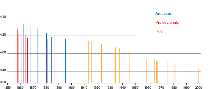
I have compiled a list of the top running performances worldwide for distances of 100 meters up to the marathon separated by the date they were run. I have included top times for Canadian men at 5000 meters, 10,000 meters, and the marathon in order to compare how Canada has progressed as a whole. Data presented is thanks to the IAAF website, the Association of Road Racing Statisticians (ARRS) and a personal communication from Marathon Canada's founder, Alex Coffin. For this post I restricted myself to men's performances only, but I do also have times for women, which I can include next if there's interest.
UPDATE: In the first draft of this post I had erroneously speculated on why some data appeared to be missing. You will see what I mean when looking at the men's 100 meter plot. A new, more straightforward, explanation is given. Thanks to Dr. Alex Hutchinson from Runner's World for pointing this out, and reposting this blog entry on his Sweat Science column. I know he more typically reports peer-reviewed publications. Not many blogs get cited! End of update.
Why have I gone to the trouble of compiling this data? Given my quoted sources, there are already top performance times available on the web. It is true the data is out there, but the raw data I found was never enough to satisfy my curiosity. Top running lists show who's the fastest, but I wanted to know when these times were accomplished. These graphs were made for my own interest because top lists do not illustrate the two-dimensional aspect of the performances; both the race time itself and the date it was set are equally important aspects. In plotting these sets, it can be noted that certain -sometimes unexpected- clusters appear.
Graphs such as the mile record progression I found in Wikkipedia as shown below, I find to be wasteful of the available space. This plot hides as much information as it presents. No matter how many runners get close to El Guerrouj's 1999 record of 3:43.13, these men will never be depicted in the plot.
 |
| mile record progression |
Hence in plotting progression lists most accomplishments and the overall progression in the sport may be masked by a single individual. This masking is can be very problematic in some events such as the men's pole vault and high jump thanks to the amazing feats of Bubka and Sotomayor who have held their records for 18 and 19 years, respectively. I wanted to make these graphs more interesting. Someone else must have made similar graphs at some point, though I am not familiar with them. If someone out there knows if they can be found, I'd be happy to acknowledge their work.
Regarding my plots, the cutoff times are somewhat arbitrary. It is a combination of available data and plotting sufficient data in order to see a pattern (real or artificial). These plots soak up a lot of data, and a minimum of 200 points is necessary before interesting patterns emerge. Many time cutoffs used here are not round numbers; the world best 5k times shown are those below 13:07.3. Obviously can you use whatever cutoff you want, but one issue is that artifacts start to appear as times get slower; only those chasing world-class performances are regularly reported and listed in reliable databases.
If you want, you can imagine each graph as a 2-D histogram (3D image) where column height would emerge from binning grids of race date x time. Trying this created more problems than it solved, so I didn't bother publishing the graphs. Your eye does just as good a job at seeing where dot density is highest anyway. I have also included multiple data points, i.e. all the top performances, for individuals. Conversely it would be unfair to relegate, say, all of Guerrouj's 20+ top 1500m performances to a single point; every one of those times was well earned. It should not be forgotten that every one of these performances is exceptional. The slowest time on any one of these plots remains an upper-echelon world performance easily placing itself in the top 0.0001% of humankind.
From here on I will comment on plots individually. Without further ado, I present the top running lists for the 100m, 200m, 400m, 800m, 1500m, 5000m (track, outdoor), 10000m (track, outdoor), and marathon (road).
Men's 100m

You might notice horizontal streaks throughout the plot. These are because of rounding to the nearest 1/100th of a second. You tend to forget when looking at this data that the entire range consists of only 1/2 a second. There are also vertical streaks, which are due to the seasonal nature of the sport. The best performances tend to happen between May and August of every year. Clearly visible is the apparent lack of data for race times just above 10 seconds. This is due to top performers being listed instead of top times (otherwise the list would get too crowded here, i.e. if you ran 10.04 and 10.02 seconds, you'd only get one spot on the list).
What's also clear is Ussain Bolt is not only the fastest man in the world, he is by far the fastest. Looking at his time of 9.58 seconds you can see there is nothing comparatively close. As an overall progression however, the 100m is quite systematic. There is only one conspicuous gap around 2003 where no-one dipped below 9.90. Could this be due to new drug testing laws? Otherwise it seems from the 1970s to present the best times started around 9.95-10.0s dropping steadily to 9.85-9.95s. Running below 9.85s continues to be exceptionally rare, with sub 9.80s times regularly appearing only in the last six years.
Men's 200m

Like the 100m, there at performance cutoff for runners going above 20.0 seconds. Unlike the 100m, neither horizontal not vertical streaks are as apparent. Also you can see how mind-blowing Michael Johnson's time was in 1996. Similar to Bolt's recent 100m performance, it was off the charts until Bolt, and more recently Yohan Blake have made inroads. Otherwise if we eliminate their times the overall scatter shows very similar world best times from the mid 1980s onwards, i.e. every year a handful people dip below 19.80 seconds. Again only in the last five years have times below 19.70 seconds been more frequent in particular thanks to Bolt, Gay, Blake, Dix, and Johnson.
Men's 400m

The 400m race is a curious distance. One thing, nationally speaking, is that Americans dominate this distance like no other; almost all of the top times come from there. The golden age of the 400m was clearly during the late 1980s to late 1990s. This was led mostly by Michael Johnson but includes Reynolds, Watts, Everett, and an amazing time of 43.97 way back in 1968 from Larry James. More recently Jeremy Wariner has been re-igniting the scene more or less by himself. Yet again there's a performance cutoff visible above 44.4 seconds; fewer times hover around this value.
Men's 800m

The 800 meter plot is one of the most unusual. For some reason there have been three distinct eras in the distance: first in the mid 80s (led by Koskei, Coe and Cruz), again in the late 90s (led by Kipketer) and the last is upon us, led by Kaki and Rudisha's still fresh world-dominating performances. The plots depict legendary charges being led by a few amazing individuals, then followed by lulls lasting for years. Also interesting is the internationality of the 800m. Shorter distances are led by caribbean and american runners, longer by East Africans. But the top 800m times have come from the likes of Kenya, Denmark, Great Britain, Brazil, Sudan, Russia, Switzerland, Norway, and the USA.
Men's 1500m

It was really surprising to see the dense clustering of 3:30 to 3:31 times in the late 90s to early 00s Explanation? I have nothing concrete, but as I have learned from Sweat Science's Alex Hutchinson, EPO testing began right around that time. One thing that is clear, however, that the golden era of the 1500m forged by the great El Guerrouj has come and gone. Sub 3:30 times are becoming rarer and the overall shape of the graph is completely different from both shorter and longer distances. It is also the most tactical race I have ever seen, where every lap seems to be led by a different runner. Slower times could also imply people are different strategy for winning races (in the sense that Olympic middle distance times are often slower and more tactical). Again, I have no idea.
Note the performance cutoff for the 1500m is 3:31.5
Men's 5000m (track)

Among the world's best times posted, they appear to come in July, August or September. The 5k is very seasonal. Also noticeable is that since Gebrselassie's breakthrough in 12:44.4 in 1995 (still the 6th fastest time ever), performances have remained robust and consistent for the last 17 years. You can see there is a constant supply of sub 13-minute runners every year since 1995. The plot also shows how incredibly rare sub 12:45 performances are, achieved by only three men in history (Komen, Bekele and Geb). The visible gap of times just above 13:00 is from the cutoff; the same as for the shorter distances.
I have included the 20 fastest Canadian 5k times in this plot. Part of this post was meant to show how our athletes are doing. By the looks of this graph, not very well. We have yet to crack to 13:10 barrier, far slower than any of the top 383 performances shown here. The extra bad news is that we're not improving; the top in Canada between 1986 to 2007 have remained similar (13:20 to 13:28); no-one has made inroads on these times in the last five years.
Men's 10,000m (track)

Like the 800m and 1500m, the 10k has had two eras of greatness followed by relatively 'slower' periods. The first boom was thanks to Gebrselassie (and Tergat); the second was from Bekele (and Geb again). But unlike the 5k, there is an overall progress toward faster times. Note the extra density of sub 27:00 times within the last two years, which has never happened before. There's a similarity with the 400m pattern, though I find each of these plots has a life of their own. Some fast times are coming soon on our doorstep. A small gap has emerged recently between sub and over 27:00 that did not exist a few years ago.
The canadian times are all well above the international mark, save for one point at 27:23 due to Simon Bairu. Thanks to his running accomplishments (including XC races) there's hope that canadians can compete internationally. Canada has been generally struggled to find runners who can go under 28:00. We have also had roughly the same level of talent since the early 80s. Given our growing population, this implies we're just not focused enough or funding distance track athletes in general.
Men's marathon

The marathon is among my favorite plot (and running distance). It's clear from looking at the top international times that times are getting faster; the shape is very triangular, like a cone spreading out, indicative of an overall improvement in the sport. A huge number of world records have been set in the last five years, obvious to anyone paying attention. The marathon is hot right now, and we are in the middle of an era we'll remember for a while. The marathon is becoming something almost unrecognizable from ten years ago. Already sub 2:05 times are becoming eerily common.
Now for the Canadians. The good news is thanks to Reid Coolsaet, Eric Gillis, and Dylan Wykes we have almost returned to the quality we once had in the 1980s and early 90s. What worries me is there are so few chasing their heels, save perhaps Simon Bairu. There is also a gaping hole in canadian marathoning between 1995 and 2008. This seems tragic given our earlier competitive times. It would be excusable if we were running good 5k and 10k times meanwhile, but alas we did not. What happened? Did we lose the will to run far, or did training fall apart? Jerome Drayton, Perter Butler, Art Boileau, and David Edge. It wasn't just one guy who ran well back then. Some them should have passed along the knowledge gained. The pass was fumbled, so it seems.
Regardless, there's such a huge gap between 'us' and 'them' (over three minutes) I decided to squeeze the top 20 Australian times to fill the space. Australia has a smaller population (22 million) than us (33 million). With our similar economy and size there is no obvious reason why we cannot better compete. Recently the Australians have also been faring worse; their best guys have been getting slower and they have not produced a new top 20 time in 8 years. Apparently resources are being directed elsewhere (Swimming for them, hockey for us?)
Conclusion
What's fun about these plots is they tell us everything and nothing. The times are there to interpret but finding answers is completely subjective. Are slower periods because we've gotten worse or because natural up and down cycles are inevitable? Perhaps a less competitive period of a year or two is necessary while top runners build up to specific (Olympic?) years. And if a new form of training emerges the entire field will get faster. If drugs tests get better the field might instead get slower. Trends/fads, prize/sponsorship money, and rivalries all play a confounding role. The rest is guesswork.